

Choosing the cover for my debut cookbook, Everyday Entertaining, was a much longer and detailed process than I ever imagined. However, it was very exciting and I enjoyed every bit of the process!
You can pre-order Everyday Entertaining here.
Today I’m sharing the behind the scenes of crafting the cover image, choosing between different cover designs and how we ultimately chose the winning cover seen below:
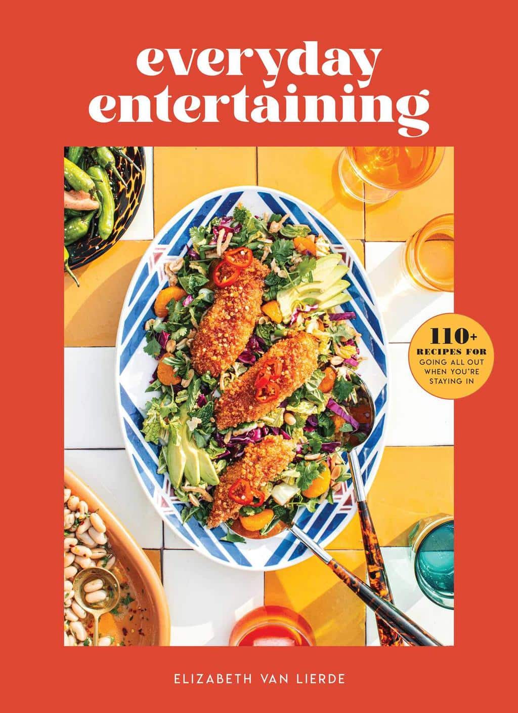
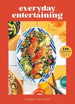
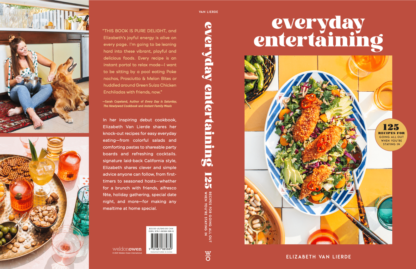
Choosing the cover of Everyday Entertaining!
Choosing the cover for the cookbook was an extremely visual process. The entire time I had a color palette, certain props I wanted to use and overall feel in mind that I wanted to achieve.
I wanted the cover to be playful, cheeky, approachable and give hints that it was not only a book on entertaining but also filled with great recipes for everyday cooking.
My publisher Weldon Owen was great about stepping in with guidance on what food to choose (friendly recipes for the home cook) and making sure the cover had a great overall eye catching aesthetic that would stand out on shelves and in an online market place (the red on the cover is an example of this strategy).
After going through a few standout recipe images that may have been cover contenders, we (the publisher and I) ultimately decided that the cover would be unique and feature a few recipes rather than just one dish, from here we made a plan to achieve a unique vision.
Pre Order Everyday Entertaining out August 10th!


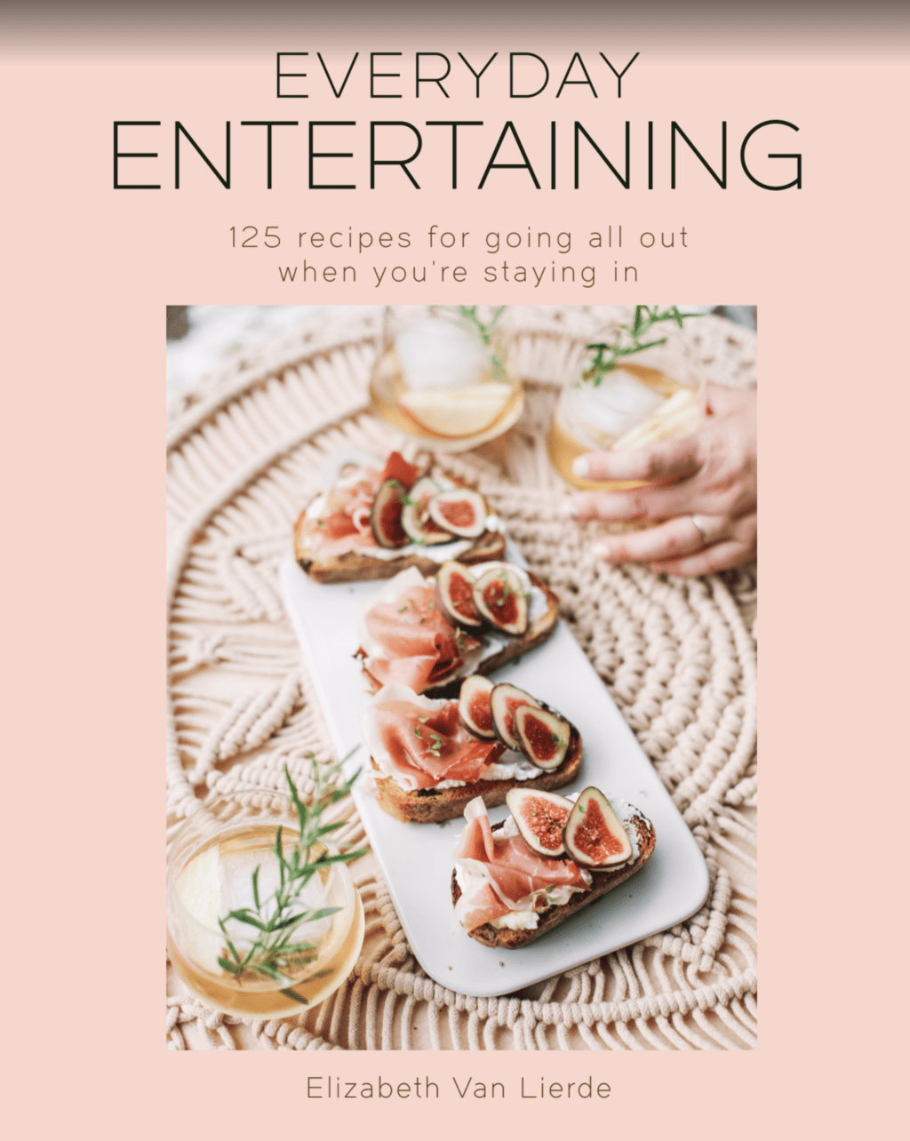
First mock up of the cover:
Before the cover was even the ‘cover’ the book needed a mock up cover to be used for sales purposes.
We chose this cover over a year ago to help sell and pitch the book. It was simply a place holder but still needed to give off an overall ‘vibe’ that the book would cast.
I think in my gut I knew the cover would never be pink, but it was cute and did the job. This recipe isn’t even featured from the book (it was from an old Friendsgiving blog post), but it had represented ‘entertaining’ well, and worked for the time being.
Recipes we thought might make the cover cut:
We went through a series of cover rounds where we thought we could re-purpose one of the recipes from the book. This is a pretty ‘normal’ way of choosing a cookbook cover.
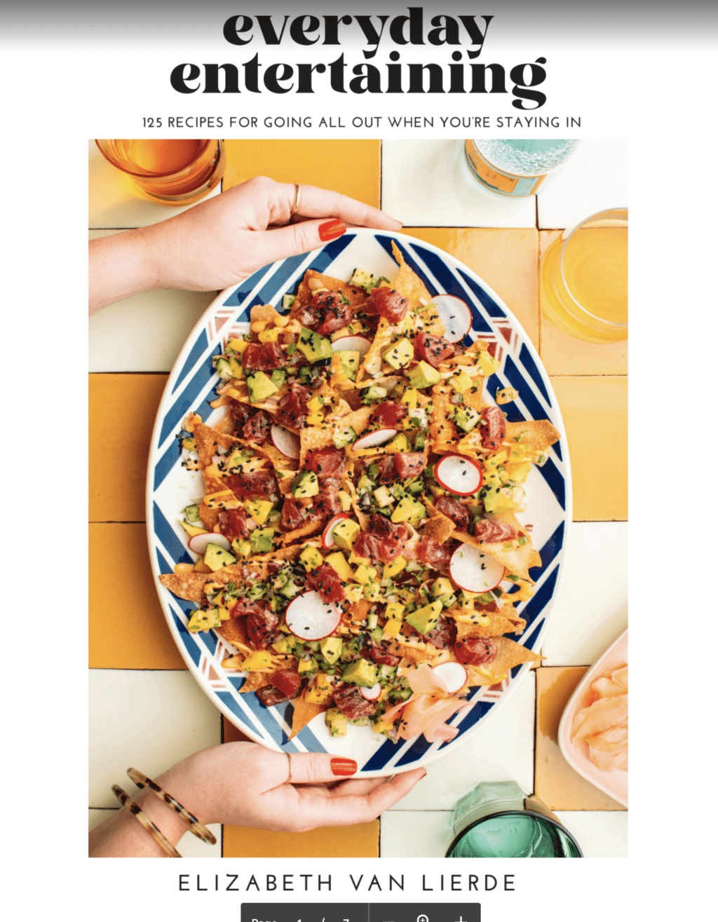
The peach panzanella salad and the poke nachos were my top two choices for ‘recipe’ style covers.
The peach panzanella salad is visually gorgeous and represented the color palette and flavors in the book well. It was also a vegetarian friendly and an easy dish to make which would be helpful for sales and to the consumer.
However, it just didn’t totally exemplify ‘entertaining’ and almost felt like a summer recipe book.
The poke nachos cover was what I originally thought would be used. When we shot this image I just had this overwhelming feeling that it would be the cover. I loved how playful the image was and the food was visually delicious. My publisher and editor gave me a large reminder that raw fish dishes could be seen as intimidating for an average home cook and wasn’t as overall appealing…
So it was back to the drawing board…
Deciding what Recipes would be on the cover:
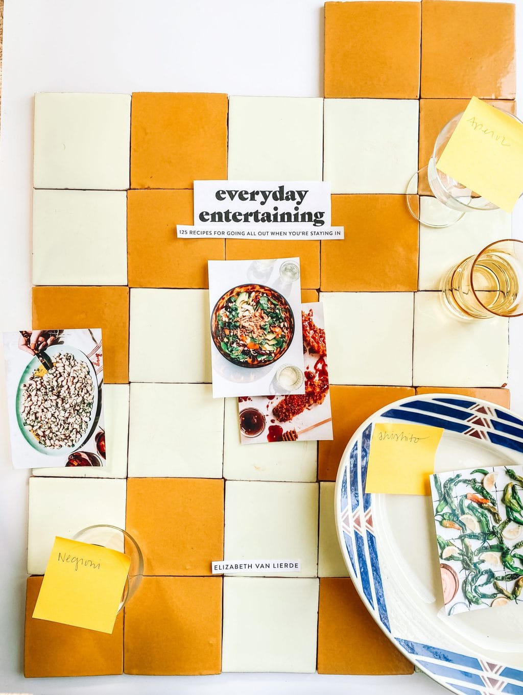
Now that we had more of an idea of what was, and wasn’t working, we were able to make up a real plan to shoot the cover. The cover plan was to pick 3-4 recipes that were visually delicious, easy to make, and offered a wide variety of flavors.
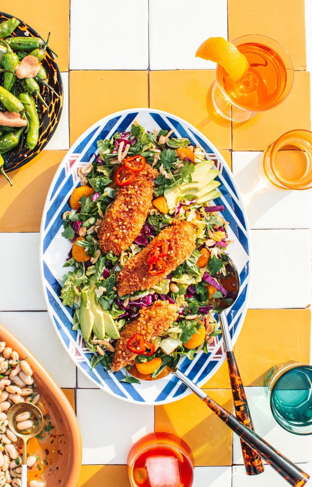
Recipes seen on the cover:
- Hot Honey Chicken Tenders– Chicken is a consumer friendly recipe choice and one of the most easy and delicious recipes from the book.
- Thai Siam Salad- This salad is extremely colorful and gave us the ‘pop’ that we needed for the cover. Plus, salads have historically worked well with my audience.
- 10 Minute Cannelini Bean Salad– An easy, healthy and vegan friendly recipe.
- Shishito Peppers with the Sauce– The shishito peppers offered some variety to show that not only was there main dish recipes but appetizers as well. Plus they are SO colorful.
Creating the cover design concept:
The entire cookbook is VERY colorful.
Every recipe, in every chapter had a planning process that would keep everything looking bright and poppy. I took time conceptualizing and working with my assistant Abbie on a cohesive color palette. The cover would also need to reflect this. The book has an overall ‘warm’ tone with primary colors so I knew that yellow would make for a great background color.
As I mentioned earlier I loved the way the poke nachos photo turned out, so we used that as a large source of inspiration.
We used the same tiles and the platter because it was very unique looking and I hadn’t really seen another cover like it. This platter that we used in the center was a special Etsy order. I bought the platter from a vintage prop seller in France and had it shipped over. It was such a unique piece that I knew I wanted on the cover.
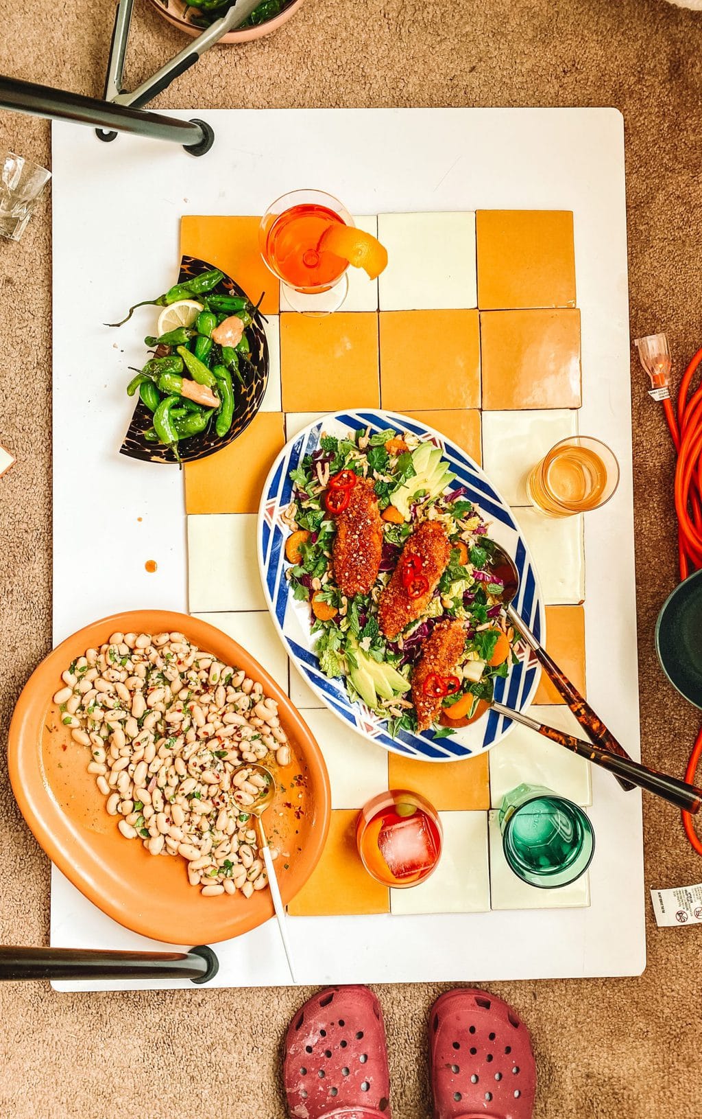
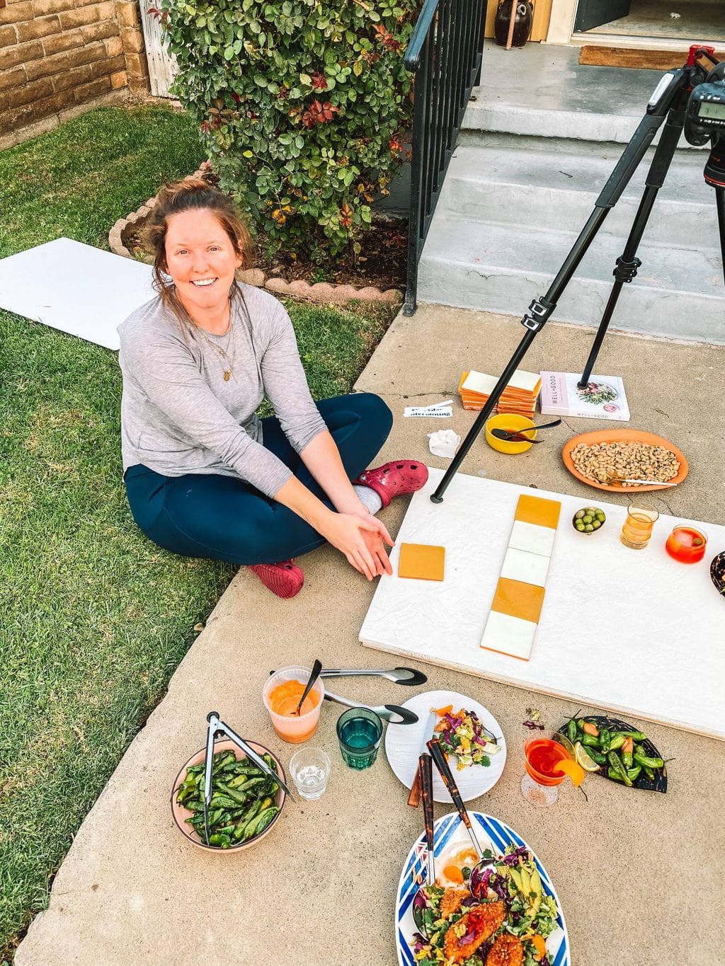
We shot the first half hour inside in my home office for a ‘natural’ light look.
Honestly, the whole shoot was a little messy and I thought there would be a re-shoot the moment we started. I broke a window open with my tripod (the camera fell into it as we started shooting!), I broke one of the dishes in the shot (the tortoise shell plate) and we couldn’t find the right lighting (most of the recipes were shot in direct sunlight but this was a weirdly cloudy afternoon in CA).
We persevered and got the shot. I texted the publisher images through out the day some sample images and they were able to piece together a mock cover to see if it would work.
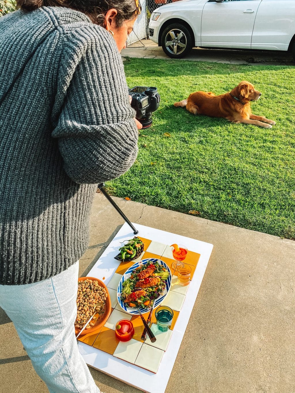
In the 9th inning we moved the ENTIRE set up outside to try and catch a little bit of sunlight seen coming through.
Ultimately, this was the best play. We got a mixture of harsh sunlight and clouds for the perfect lighting combo. I absolutely love how the cover image turned out and it was worth all the broken glass, sweat and hard work that went into it.
We tried a white background as well just in case we needed a safer option, but the tile pattern won my heart over.
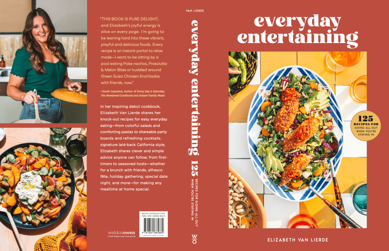
Other cover contenders:
Now that we had THE photo. It was time to mock up some designs. The publisher was so gracious and gave us so many options to choose from (I think there were over 10 different designs at some point). We narrowed it down to three different options…
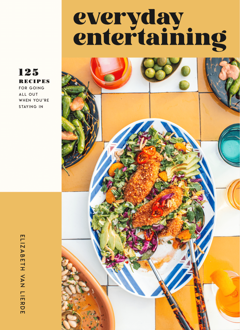
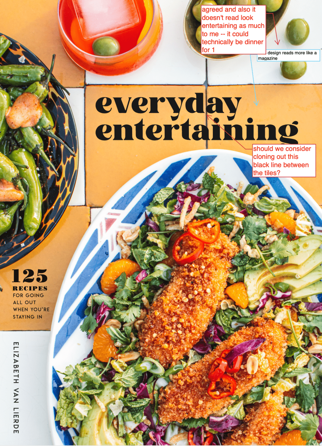
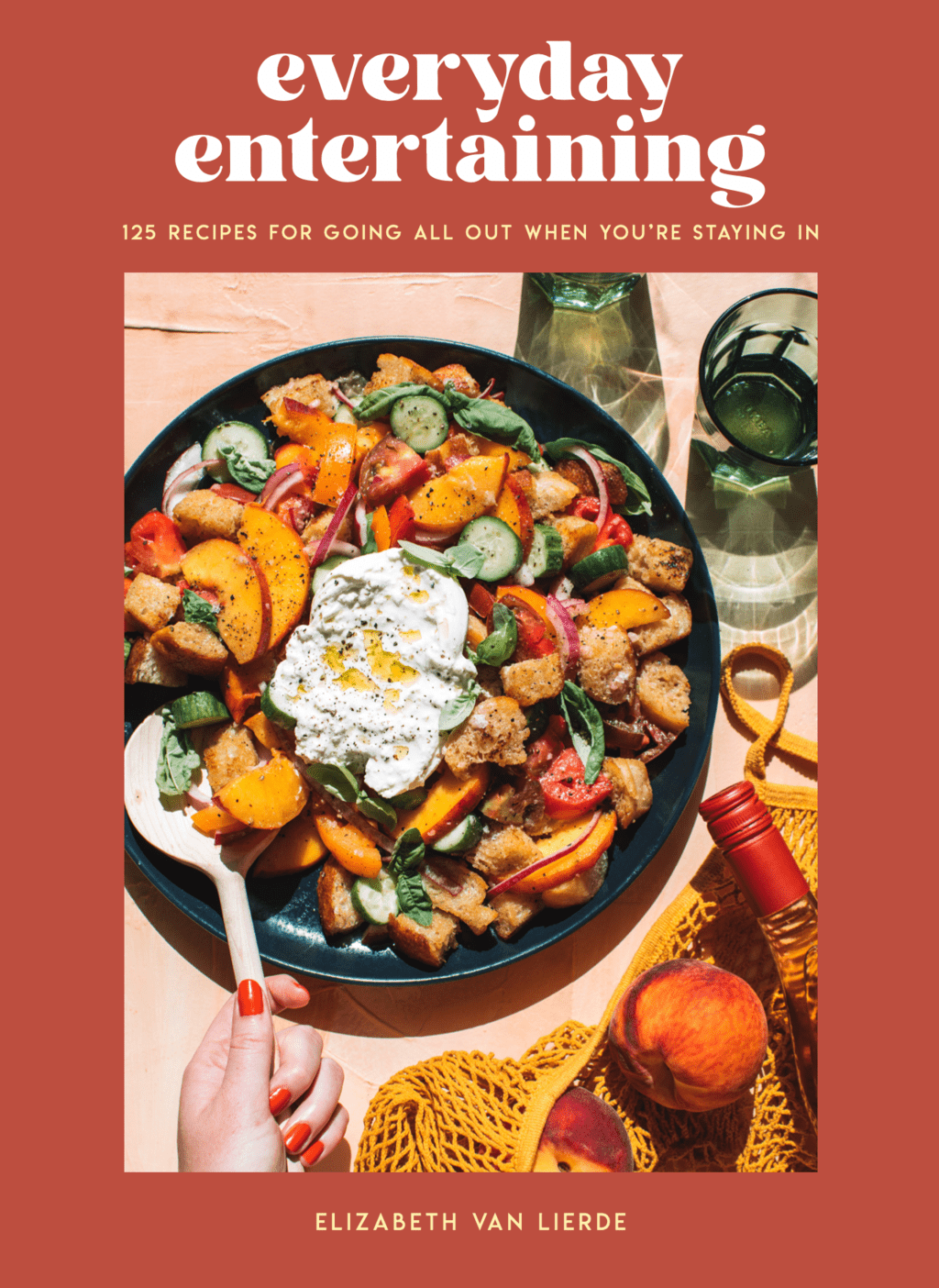
Ultimately we went with the solid poppy red because it was the strongest, most memorable cover. It stood out on online retailers like Amazon and Barnes and Noble and didn’t look like other covers with similar layouts. Red and yellow are my favorite colors so I was thrilled with the decision and felt like it really embodied the book and my brand.
Picking the Spine:
Once we had the cover nailed down, it was time for other logistics. The spine was an easy decision because the red would be carried throughout the other side of the cover so we matched everything up. I love how it looks on a shelf and think the red makes a great statement and stands out against other books.
Choosing the back cover:
I loved the idea of having 1-2 images on the back cover. We tried out single image options but it felt a little unbalanced because the cover featured such a large image.
We ended up going with an author photo, a memorable recipe (peach panzanella) and two testimonials.
We had two testimonials, one from Sarah Copeland from Edible Living and one from Grace Elkus from the Kitchn. Both talented friends of mine and I felt so fortunate for their shared quotes and expertise.
Creating a cookbook cover was one of the most exciting things about writing the book. The process took a course of 5-6 weeks and what felt like hundreds of back and forth emails with color choices, font styles, placement of the tile and subtitle and many other key details.
You can pre order the cookbook here, it’s official debut is Tuesday, August 10th!
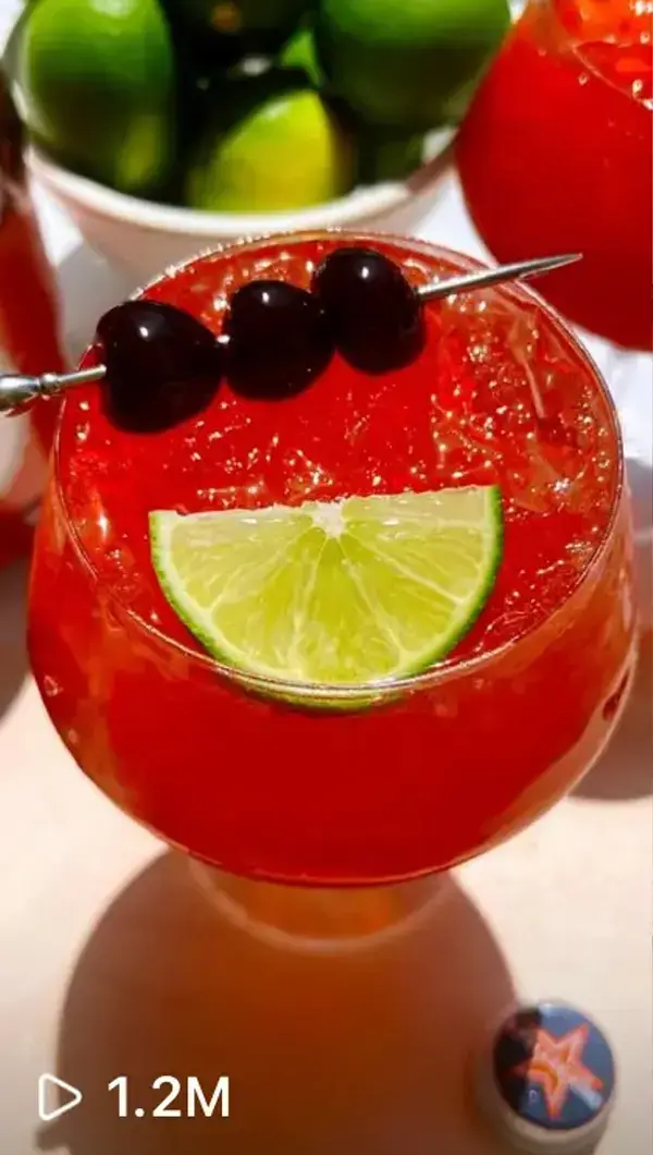


join elizabeth on the rocks
Join our newsletter to chat about all things food, cocktails, home decor, and more!